
Visualization of data is very important part of data analytics for a variety of reasons. It is the first thing that the user will notice on a dashboard. Users can read and understand visuals faster than text. Furthermore, effective visuals improve the understanding and reduces the confusion. Last but not the least, well designed visuals improve the end user satisfaction. The art of visualization is greatly enhanced with the advancement of technology, in terms of the ability to quickly create complex visual information while also cheaply distributing it via digital means. In contemporary society we are all surrounded by an increasing menu of visualization options which sometimes lead to poor fits between information and its presentation.
Approaching the design of visualisation can be quite daunting. One must find answers to complex questions – which insights of the analysis should be visualized; how to communicate the data in the right way; which chart to use; how to make the insights intuitive; how to facilitate decision making using the insights. Much like conventional grammar breaks down a sentence into nouns, verbs, punctuations and other elements of writings, the notion of a graphic can also be broken down into its constituent parts – the data, scales, coordinates, geometries, aesthetics. By understanding the basic visual design principles and their implementations, figure authors may find new ways to emphasize and convey their information. Enumerated below are few principles that will help authors improve their visual message:
Understanding the Context
Often the sponsor – client, stakeholder, manager – of data analytics project have in their head things about the project that they may not express out loud. It is important to be clear about these contexts upfront to reduce the iterations down the road. The following points can help extract the full context
- Background information about the business or problem that is relevant/essential
- Audience background and also relevant facts about the audience – use cases, problems they are interested in etc.
- Understanding of the constraints – project deadlines, branding guidelines and limitations, inaccessibility to analytics tools, process rigidity for disseminating and consuming of data etc.
- The biases the audience have that might make them resistant to the message
- Available data that would strengthen the case being brought out through analysis.
- Familiarity of the audience with the data used in the analysis. It is also important to consider if the data has precedence or it is being used new.
- A definition of successful outcome
- Articulation of the results of the analysis in a single sentence or in few sentences that can be communicated within a single minute.
Finding answers to these points will ensure that there is a robust understanding of the need eventually leading to getting the narrative and messaging right.
Choosing an effective visual
In creating the visualisation for data, a very important step is choosing the right visual display. This depends on the information that must be shown – relationship between two variables, a distribution or a comparison. Here is chart chooser guide developed by Andrew Abela (www.ExtremePresentation.com).
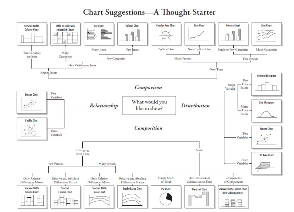
In practice choosing an effective visual means allowing to iterate and selecting the graph that will create the magical moment of understanding for the audience. This can be achieved by listing down all possible ways of visualisation of data and then evaluating pros and cons of each. Owing to their differences in graphical literacy and familiarity with data this moment of understanding may differ between an analyst and the actual audience. Therefore, after selecting the visuals, it is best to seek a fresh perspective from people less familiar with the data.
Let us consider below the suitability of each of the graphs:
- Vertical Bar Charts – Great for categorical data
- Horizontal Bar Charts – Good when the category names are long
- Stacked Charts – Easy for the eyes when comparing heights to a consistent zero baseline. But this is often misused. While the first segment (bottom most) is easier to compare, but the segments up in the stack don’t line up
- 100% Stacked Charts – It has two baselines for comparison
- Column Charts – Very suitable for time series comparison
- Pie Charts – Use this for categorical comparison only when the number of categories is less than 2-3.
- Line Charts – Most effective with continuous data, often time series data
- Scatter Plot – Good for encoding data simultaneously on two axes to identify what relationship exist
- Slope Graph – A fancy word for a line graph with only 2 points. Useful to focus on change between two points in time or difference between groups
- Water Fall – Additions and deductions. Often used in financial context to show variance to budget
- Heat Map – Can work well when exploring data to find out where to dig further. Eyes can pick out big differences in colour intensity, but smaller ones don’t stand out.
- Square Area – Good for showing numbers of very different magnitude or as an alternative to a pie chart. Grid is important because we tend to overestimate areas
- Simple Text – Very effective to show aggregates and summary numbers that can stick out
- Tables – They are straightforward way of representing data but take quite a bit of brainpower to consume data
Eliminating clutter
Often the visuals have many elements that make it more complicated to process than it really is, like gridlines, harsh bolding, lengthy digits, rotated x-axis labels, out-of-place legends. Eliminating all such non-essential elements from a visual is a critical step in communicating effectively with data. Information visualization expert Edward R.Tufte in his book, The Visual Display of Quantitative Information, introduces two interesting graphical heuristics, the data-ink ratio and chartjunk, understanding which helps in reducing detraction from information in visuals.
He defines data-ink as the non-erasable core of the graphic or the portion of the graphic (i.e pixels) that makes up the data information. So, data-ink ratio is the amount of data-ink divided by total ink required to print the graphic. There are five principles related to data-ink put forward by Tufte:
- Above else, show data
- Maximize the data-ink ratio
- Erase non-data ink
- Erase redundant data-ink
- Revise and edit.
Adhering to the above principles makes the graphic more straightforward and readable and increases the amount of information the viewer sees.
Tufte defines chartjunk as the excessive and unnecessary use of the graphical effects in the graph. In other words, chartjunk refers to all visual elements that are not necessary for the chart view or which distracts the users, or superfluous labels or decorations that do not convey data. Adding extra stuff is not always informative as sometimes it gives the cognitive load. Therefore, it is important to kill the frills and get to the point.
The next important concept which is also advanced by Tufte in his next book, Envisioning Information, is significance of negative space or white space in visualization. White space improves readability by ensuring that graphics and texts are legible. Effective use of white space has been shown to improve content comprehension by as much as 20 percent. White space helps reader understand the content better by creating a sense of order and flow between graphic elements. It is one of the creative tool, helping to more effectively convey a message. In order to effectively use white space the number of elements in page should be limited to 5-7 and not more.
By stripping away the excess, the underlying data is presented in a way which communicate the thought better, provokes reader’s attention and ensure reader does not flow in information overload.
Using colour meaningfully
Colours when used strategically, in explanatory analysis, is one of most powerful visual communication tools. The colour attributes (hue, intensity) are preattentive attributes that our brain is tuned to pick up even before seeing it. Thus, colour can be used to grab audience’s attention to a select element amidst a group of elements. However, colour can grab attention only if used sparingly. The more things we differentiate, using colour, the lesser is the degree to which any one of them stands out. So, it is advisable to use colour only to emphasize the most important elements.
Colour also signals audience where to look. If audience are presented with a screen without any visual cues they start from top left and read in zig zag ‘Z’ pattern. However, if there is a single bright colour on a page, the audience eyes will be drawn there first. Building on this, colour can be used to signal, for example, all sorts of differentiation – data that is above average vs below average, or trends that are growing vs declining, or top factors in an analysis. At the same time, if there is emphasis on multiple things within a page then they will compete for drawing the eyes leading to lack of focus.
Additionally, colour can be used both to encode quantitative information or as a qualitative differentiator. For example, intensity (varying level of saturation of a given colour) can carry some numeric value whereas hue (what we typically think of as colour – red, blue, green etc.) can be used for categorical differentiation.
Furthermore, colour can also evoke different emotions and tones. For example, black can communicate elegant, bold, powerful. Blue can communicate confident and classic. Red can communicate aggressive, speed, danger. Yellow can communicate youth, friendly, positive feelings, sunshine. Pink can communicate exciting, playful, flirtatious. Another example is if in a visual if there is red colour which is trending upward it signifies a negative thing whereas if there is a green trending upward it means a positive thing. If the organization has a brand colour, then using the brand colours attaches the personality of the brand to the visuals. But if the brand is very colourful then it is not necessary to use all the brand colour but instead picking one or two brand colours and then adding complementary colour is most effective. An important caveat to keep in mind is that the meaning of colour varies with the culture. So while communicating with international audiences extra care needs to be taken to ensure that the selected colour does not end up signalling a different meaning then its original intention.
Also, while choosing colour, it is important to recognise that lot of people are colour blind (almost 8% men are colour blind) and cannot distinguish between shades of green and shades of red. So when using these colours together it is advisable to use some additional visual cues – making them bold, using positive signs (green upward trending) and negative signs (red upward trending), and using legends along with colour. Finally, whenever some meaning is assigned to colour (linking colour to categories, regions, metrics etc.) then it should be used consistently for audience to familiarise and learn.
Telling a compelling data story
To connect with the audience, the analysis must go a step beyond showing data and tell the story of the business. Stories resonate and stick in a way that data cannot. Purposeful story can bridge the gap between showing data and imparting information. Let us understand in detail the process of creating powerful story from the data.
The first step is to form a “Big Idea” by considering the broader purpose or context that the data serves. This means identifying what is at stake for the audience, what they need to do, and coming up with a concise and compelling action statement. This single sentence then becomes the guidepost in evaluating individual graphs, in terms of whether it reinforces the overarching goal or is distraction.
The second step is to spend time making the story prominent and visible. This means leveraging visual cues in the data visualization process to direct the audience’s attention. These visual cues can be strategically left on page/screen by using preattentive attributes like size colour and placements, prodding audience where to look. Without these visual cues the audience may decide not to pay attention and move on to something else, thus leading to loss of opportunity to communicate.
Finally, avoid taking the audience through the same chronological path, as was used during analysis, to reach the conclusion. This delay in getting to the point can be costly in terms of loosing attention of the audience. A far more effective approach is to start with the conclusion and work back (only if necessary) to the path that led to it. This can be done through storyboarding approach which establishes a structure for the communication and ensures that the narrative is on the point.
Conclusion
Data visualization maps values to visuals or in other words turn numbers into pictures and stories. It allows us to explore, explain and understand the data in a different way, creating a window of opportunity to grad the hidden pattern and insights. Data visualisation sits in the fun intersection of science and arts. Science in terms of guiding principles and best practices to follow. Arts in terms of making different choices about approaching the data visualization nuances or having a personalised style. While the personalised styles vary a lot, following the guiding principles ensures that data visualization being created are effective.